Introduction
Convious is an end-to-end sales & marketing platform for attractions. Think of theme parks, zoos, museums, and more. They use machine learning to create models that can predict how venue visitors behave and provide a full range of connected, drop-in modules for the entire visitor journey. Before, during, and after a visit. Examples include a standalone checkout, a dynamic pricing feature, a park map with search and filters, and more.
Convious works with more than 130 partners across 16 countries and has been growing rapidly over the years. This has meant lots of opportunities, ideas, and requests for new widgets to be built or for an extra layer of functionality to be added to existing widgets. With a backlog large enough to keep all their teams busy, they turned to Unless for help.
The no-code digital experience platform of UNLESS allows teams to unite their customer data sources and rapidly create, launch, and test personalized UI components in any existing website or dashboard. This way, you can expand your widget portfolio in no time regardless of the original technology and without distracting your developers.
As a drop-in SaaS service, Unless can be added to a website or web application with a single javascript snippet. This simple setup means you can distribute your widgets across the products or websites of your partners in no time.
"With Unless, we have been able to expand our widget portfolio dramatically. The ability to fully customize, A/B test, and configure components according to the needs of each partner has been a real game changer. Unless has simplified our work and given us speed. The development time we saved could be dedicated to other features." - Camiel Kraan, CEO at Convious
Examples of experiences
Adding a My Account section to the Checkout widget
One of the products that Convious offers its partners is an overlay checkout widget that is fully branded, highly customizable, and can easily be added to any partner website. The checkout is an online ticket shop for the attractions, where website visitors can select and buy tickets and products, whether it's one-time tickets, season passes, vouchers, gift cards, or something else. You can see a screenshot below of what the demo version of this checkout looks like.
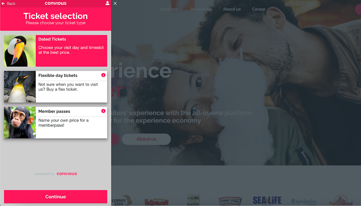
However, while it was possible to make purchases using this checkout, some of Convious’ partners had an additional request. They wanted their customers to have an account section in the checkout widget where they could see past orders and manage their accounts. However, it would be costly and time-consuming to build this functionality as a fully customizable component that can be A/B tested and configured according to their partners’ wishes. As this is exactly the strong point of Unless, the company built a custom “My Account” component for Convious and its partners to use.
Once a user clicks the profile icon on the checkout widget, they will see a pop-up. This pop-up and everything you see from that point on is an Unless component. The component directly connects to the Convious APIs to authenticate and fetch orders, subscriptions, and account details. Below are screenshots showcasing what that looks like as demoed on the Convious website.

With this component, a user can receive an email with a special link to log in to their account, adjust their details and permissions, review and manage their subscriptions, and view their orders. All of that functionality is within a single component!
Also worth mentioning here is the technology-agnostic nature of Unless which allows for its components to be easily distributed across a large number of websites. These components are customizable and brand themes can be defined. This means it is easy to make some simple changes and the component is ready to be used on any partner website! Below you can see an example of what this looks like on the website of one of the venues. Different look, same functionality, easy to distribute across all partners.
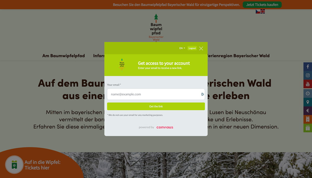
On a related note: You may have noticed that while the content in the component is appearing in English, multiple languages are possible. This component in particular is available in English, Dutch, German, and French.
Bringing the Park map into the browser
Convious aims to create seamless customer experiences across devices and channels and as part of this goal their offering includes the Tap mobile application. Tap enables venues to be in touch with their visitors before, during, and after their visit with tickets in their pockets, in-app content, reminders, promotions, and more.
In the app, they also have an interactive map of the venue to make the browsing experience easier. Not sure which attraction to go to next? Check the map. Looking for restrooms or a place to eat? Check the map.
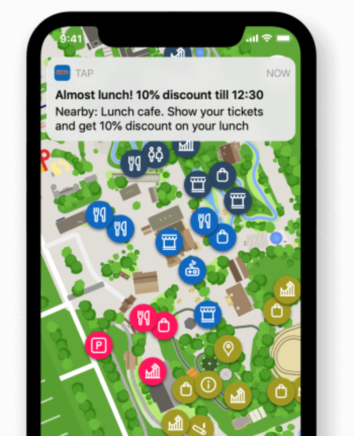
While this map was very useful in the mobile application, Convious wanted to be able to offer it embedded within a browser as well. The park map could then be used on a desktop device at home to help plan your visit. Alternatively, if you are at the venue but haven't downloaded the mobile app yet, you can still access the map in a mobile browser on the go.
Since the map was solely built for a mobile application, it wasn’t as simple as “just add it to the website”. Wanting to focus on other features and not slow down their internal development, Convious turned to Unless once again. Below is a screenshot of the inline park map component built by Unless.
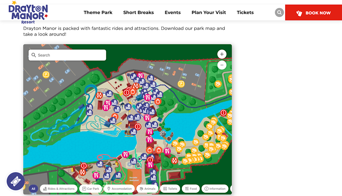
Unlike the My Account component, the Park Map component is inline, meaning it is inserted within a page between other content instead of being on top of a page. However similar to the My Account component this widget can be added to any partner website. All you have to do is point and click to define where you want it placed.
Let’s now take a look at the functionalities available within this component. There is of course a search bar so a visitor can manually look things up. If the search is for a specific attraction, then the map will zoom into that.
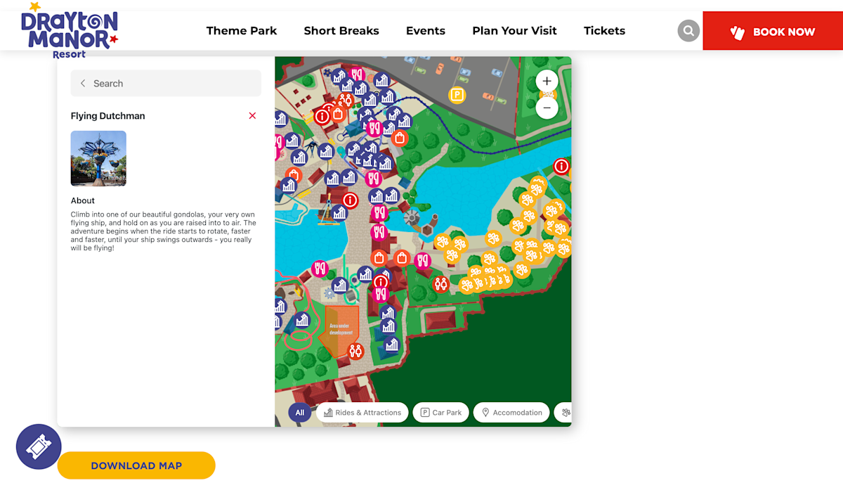
Optionally, you can click on the filter buttons to filter based on attractions, food & beverages, or something else. These filters can be defined by each venue depending on their needs. Like with most maps, it is possible to zoom in and out and to move the map around. If you click on an attraction, the sidebar will then open to give you more details such as a description, the age limit, the height limit, etc.
Key takeaways
Distributing a component across many websites can be tricky if you have to take into account the different underlying technologies, the data you need access to, and the customization required to make it fit the look and feel of each website.
Unless can speed up that process. With a technology-agnostic, easy-to-install script, customizable themes to match the branding of your various partners, and added functionalities such as A/B testing, personalization, and more, building new widgets or adding an extra layer of functionality has never been easier.
Convious was able to add many features to delight its partners with the help of Unless - without having to slow down development on their core product, leading to greater impact.


